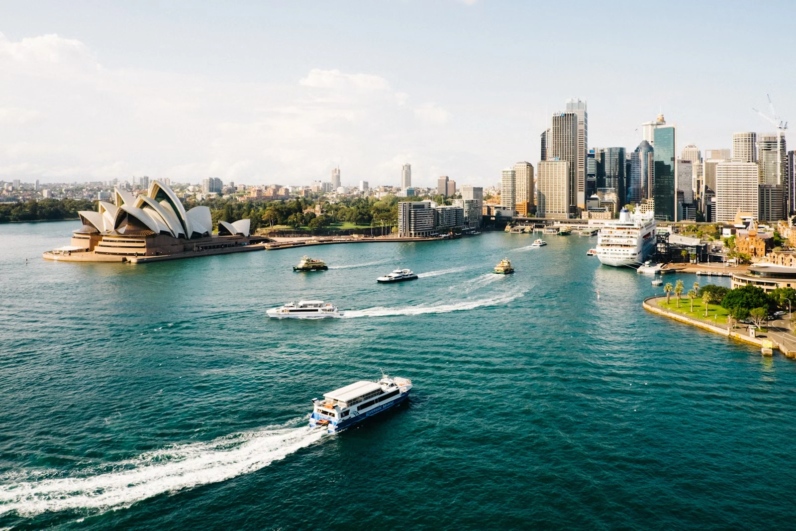
<Image
  src="https://cdn.vortex.design/docs/components/image/sydney.webp"
  alt="Image"
  width="300px"
  height="200px"
  objectFit="cover"
/>
Features
- Supports different
sizesandshapes. - Allows different
objectFitoptions. - Has
fallbackcontent support. - Accessibility features.
Size
Images can have a fixed or responsive width, height, and maxWidth.
<Image src={imgUrl} width="200px" alt="Image" />
<Image src={imgUrl} height="150px" alt="Image" />
<Image src={imgUrl} width={{ xs: "150px", sm: "250px", lg: "400px" }} alt="Image" />
Object Fit
Controls how the image scales within its container. The default is cover.
<Image src={imgUrl} width="150px" height="150px" objectFit="cover" alt="cover" />
<Image src={imgUrl} width="150px" height="150px" objectFit="contain" alt="contain" />
<Image src={imgUrl} width="150px" height="150px" objectFit="scale-down" alt="scale-down" />
Border Radius
Six border radius sizes are supported: 2xs, xs, sm, md, lg, and xl.
<Image src={imgUrl} width="120px" height="120px" borderRadius="sm" alt="Image" />
<Image src={imgUrl} width="120px" height="120px" borderRadius="md" alt="Image" />
<Image src={imgUrl} width="120px" height="120px" borderRadius="lg" alt="Image" />
<Image src={imgUrl} width="120px" height="120px" borderRadius="xl" alt="Image" />
Aspect Ratio
Use the aspectRatio prop directly or wrap the image in a Stack with an aspectRatio for responsive layouts.
<Stack width="400px" aspectRatio={16 / 9}>
  <Image src={imgUrl} alt="Image" />
</Stack>

<Stack width="400px" aspectRatio={1}>
  <Image src={imgUrl} alt="Image" />
</Stack>
Bordered
When bordered is true, a subtle 1px border is added around the image to improve contrast against backgrounds.
<Image src={imgUrl} width="200px" height="150px" alt="Image" />
<Image src={imgUrl} width="200px" height="150px" bordered alt="Image" />
Fallback
Rendered when the image fails to load or src is missing. Accepts a fallback image URL or a React element.
<Stack width="300px" aspectRatio={16 / 9}>
  <Image src="" fallback={imgUrl} alt="Image with URL fallback" />
</Stack>

<Stack width="300px" aspectRatio={16 / 9}>
  <Image src="" fallback={<Hexagon size={40} />} alt="Image with icon fallback" />
</Stack>
Accessibility
It is required to utilize the alt prop ensuring that a meaningful description is provided for users relying on screen readers. In cases where the alt attribute is omitted, the image will be considered decorative and will adopt the presentation role.
alt is required and describes the image content for screen readers and when the image fails to load.fallback is shown in place of the image, the alt text still provides context for assistive technologies.